Airlines that skimp on amenity kits are choosing a false economy. Aviation is a competitive business and people still make choices based on brand, reputation, and perception, especially in the pointy end of the plane.
Airlines have a golden marketing opportunity to quite literally have customers carry their own branding home with them, to use it in their daily lives — and to think “you know, that case from XYZ Airlines really is useful”, or even to remark to family and friends “oh, yes, that one is from XYZ Airlines’ Delightfulness Class from when I went to Pago Pago”.
As far as brand touchpoints go, it’s an enviable position to be in.
Yet after the little tubes of lip balm and hand cream are used up, too many kits aren’t re-used, and end up as waste. With airlines and passengers eyeing environmental responsibility, it’s smart to make sure that kits are as attractive — and reusable — as possible.
The first trick with getting passengers to reuse an amenity kit is picking the size and shape they need. I find that most of the kits I end up reusing are the rectangular ones, around 8-9” long, 4-5” tall, and about 3” deep, whether hard- or soft-sided.
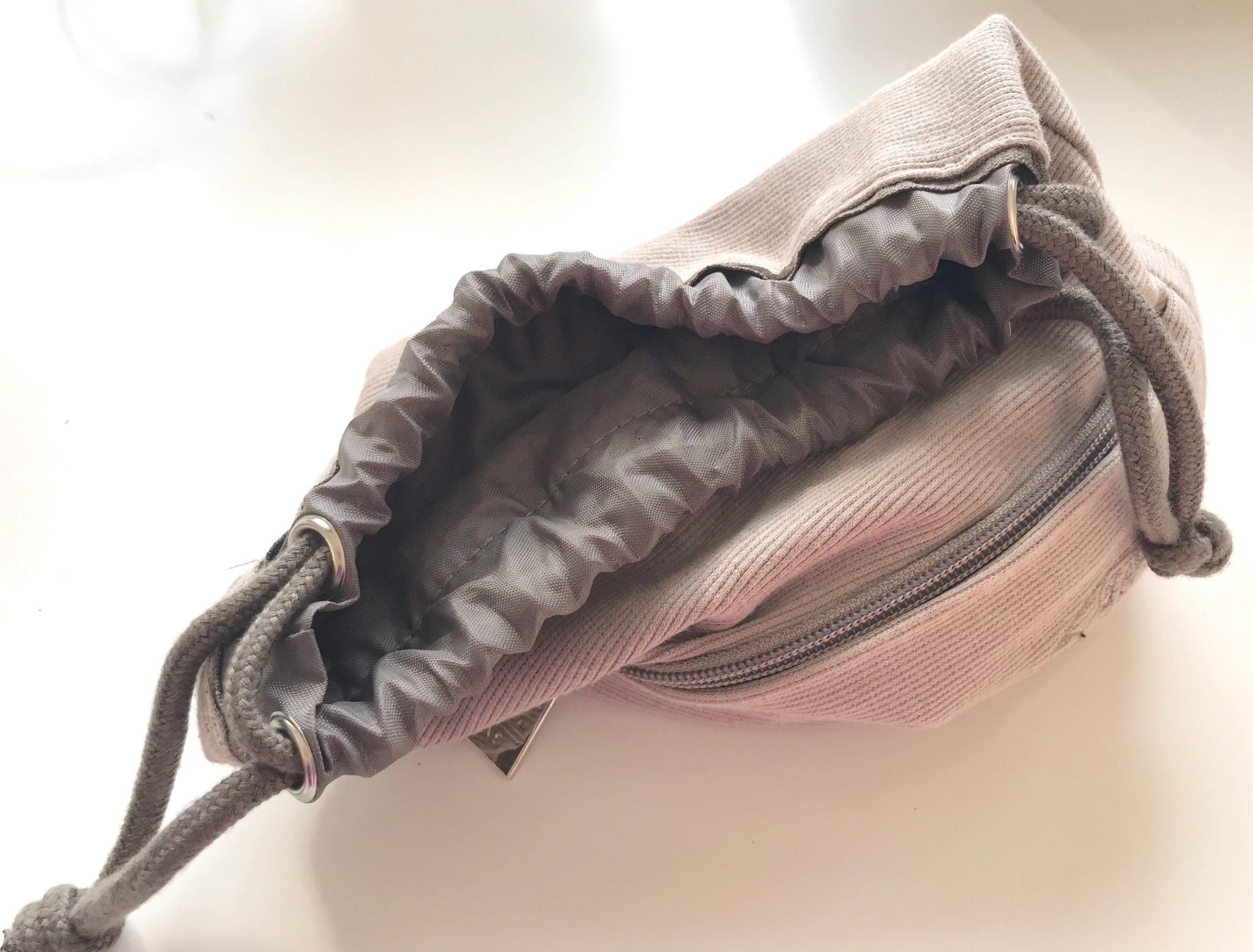
But I want to give a special shoutout to the soft-sided drawstring Air New Zealand bag that’s eight or nine years old now, which I use as a catch-all in my suitcase for those few miscellaneous items that always end up rolling about in the bottom of the bag. I’d love to see an airline with an option like this again, not least because I’m running out of those Kiwi kits!
Airlines that want to stand out from the crowd can vary from the general sizing trend but should do so carefully. Larger is certainly an option: in the years after the introduction of the iPad, numerous airlines went the way of a larger pouch to fit a tablet, although this trend has mostly run its course.
In the age of increasing ecological consciousness (and indeed a growing list of countries and localities that ban single-use shopping bags) larger reusable bags are a smart idea, particularly since they’re likely to be seen by many potential customers.
Swiss, which designs amenity kits in rotations, had an excellent example of an attractive red shopping bag with a repeating Swiss flag motif that I tuck away in the seatback pocket of the car for instances when I forget to bring one with me.
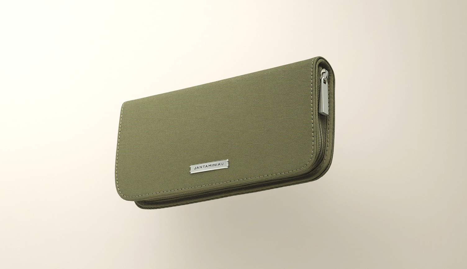
Smaller kits, too, are an option, although these risk looking and feeling a little on the cheap side unless they’re given a good amount of thought. A few years ago KLM had a slim Jan Taminau-designed travel wallet, which is lightweight, sturdy, and zips. I still use it to carry around foreign currency and the collection of international tap-to-pay cards and transit passes we’re all amassing these days.
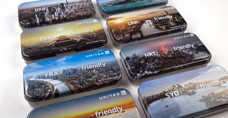
Let me also praise the longevity and general usefulness of that relatively rare beast, the airline amenity tin. While these are less useful when traveling, they’re incredibly useful around the house: several serve in my office as pencil-cases, tins for postage stamps, storage for a variety of foreign currencies, the spot where I dump my keys on the shelf by the front door, and general catch-alls. And, of course, in the workshop or garage, they’re invaluable.
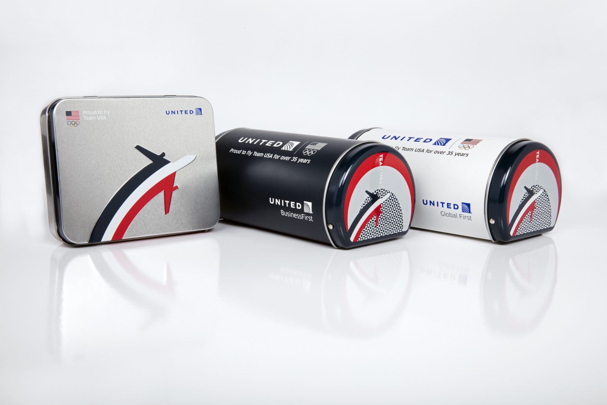
Smart airlines, though, should think about extending their branding on these tins to the inside, especially for those that have a hinged lid that is able to stay open.
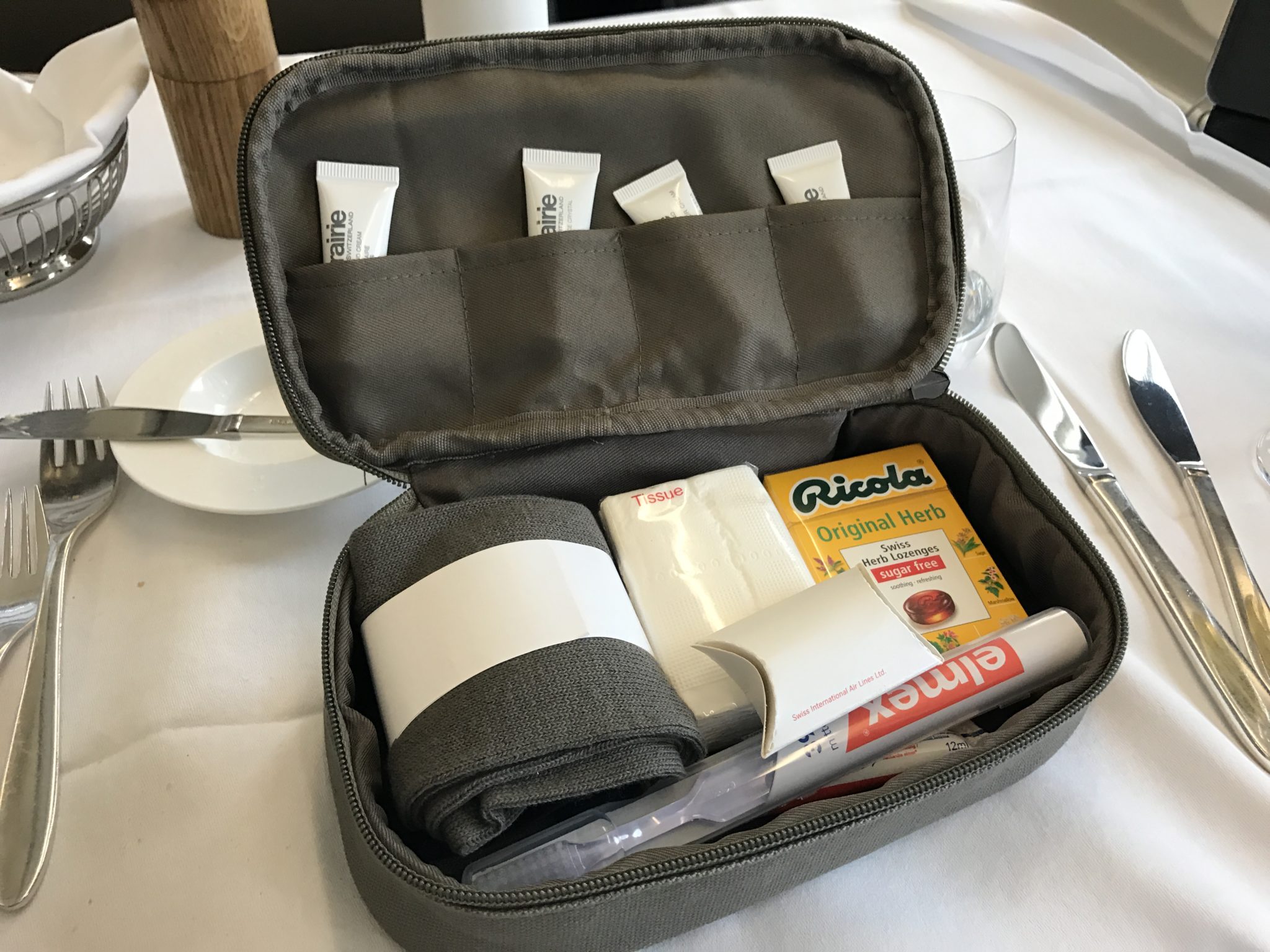
Many passengers reuse an amenity kit as cable storage for earbuds, chargers, cables, connectors, and dongles we’re all stuck with, as well as on-the-go streaming options like a Chromecast that some travelers bring from home. Frequent travelers in particular often keep cables separate because x-ray security agents sometimes pull carryons with lots of electronic wires for extra checking, so being able to toss a bag with cables into a separate bin is often a smart move.
To maximize reusability for cables and suchlike, it’s important to have little pockets about the size of a dongle or coiled-up cable, into which cables can be slid to keep them from tangling.
A key tip for airlines is to think about the design inside, not just the outside. Cables and dongles tend to come in either white or black, so a smart move is to design kits with light — but not brilliant white — interior. What a perfect opportunity for a repeating airline motif.
Co-branding works well too: just think of those hard-sided Rimowa kits a number of airlines offer, which is always in demand.
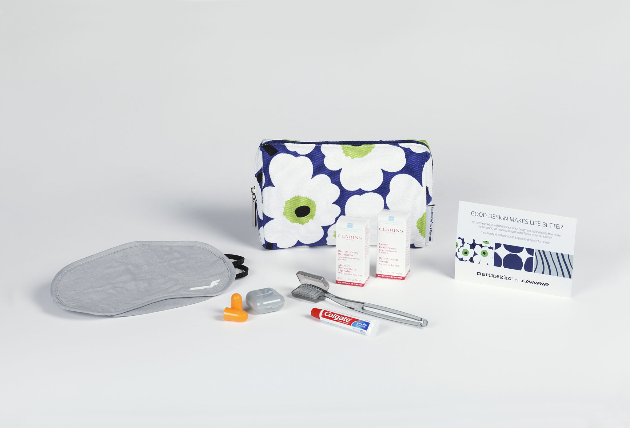
With a bit of extra thought and an eye to design, airlines can increase the number of passengers who reduce their waste bill, give them free advertising, and increase customer loyalty. Now that’s an amenity. runawaygirl.com

